In July, I showed that an otherwise careful group of researchers at the Othering and Belonging Institute were using a measure of statistical racial segregation that confounds diversity with segregation. Briefly, regions with more variety in the racial makeup of their neighborhoods will show up as statistically “segregated.” Regions where all neighborhoods are pretty similar will show up as statistically “integrated.” To their credit, the study authors corresponded with me at length and adjusted their Technical Appendix to emphasize limitations that I had pointed out.
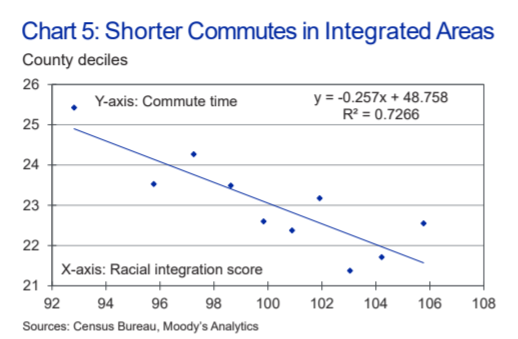
Today, Mark Zandi, Dante DeAntonio, Kwame Donaldson, and Matt Colyar of Moody’s Analytics released a much less careful study purporting to show the “macroeconomic benefits of racial integration.” But if one were to make the mistake of taking their study at all seriously it would lead one to the opposite conclusion: mostly-white counties do better economically. They discovered white privilege and mislabeled it “integration.”
(When economists talk about “segregation” statistically, they mean differences in racial proportions across neighborhoods. This is not the same as the de jure segregation regime imposed in the American South. It’s not even the de facto segregation that persists in some neighborhoods today.)
The easiest way to see Zandi et al’s mistake is to work backwards from the table of county results they (helpfully) published. The most integrated county in America, in their analysis, is Kennebec County, Maine. It’s 94.6% white. The rest of the most-integrated counties are similarly pallid – with the exception of Webb County, Texas, which is 95% Hispanic.

Photo: Kennebec Valley Tourism Council
In each of these counties, integration is a mathematical product of the lack of diversity. With hardly any minorities, hardly any neighborhood can diverge from the dominant group.
These extreme counties aren’t an accident. Whereas most researchers treat metropolitan areas together, Zandi’s team worked with counties. Several of their integration champions, like Livingston County MI, Jefferson County MO, Medina County OH, and Carroll County MD are very white exurbs at the fringe of some of America’s most segregated (in the real-world sense) cities.
The most segregated counties in their rankings are (of course) all of the most diverse and largest in the U.S. Some of those counties certainly are segregated, but what makes them show up on Zandi et al’s index is that they are diverse.
Now, the ghost of George Wallace might say, “Wow, this is a great study! Look at all these nice things that are attributable to racial homogeneity.” But that would be wrong statistically as well as morally. Simply put, Zandi’s team ran a few regressions without making any attempt to establish causal relationships and without controlling for spatial autocorrelation. There’s nothing to see here, move along.

The study’s four authors are surely well-meaning, smart men. But this embarrassment shows the need for all of us to give our work a reality check before clicking publish – especially when it relates to a topic with as much moral and emotional weight of segregation.