Geographer at English Wikipedia., CC BY 1.0
I visited Los Angeles last month, and I fully intended to take transit from my aunt’s house in Long Beach to a meeting downtown and another in Westwood. With a reality check from Google Maps, she talked me out of it and lent me her car. It’s only the second time I’ve driven around the Los Angeles area, and the experience is uncanny. You can drive for an hour…and the city looks about the same: a dense but low-rise mix of residences, warehouses, and shops with smoggy mountains in the distance.
A quick data exercise shows that LA really is unique among big American metros, matched only by its East Coast twin, Miami.

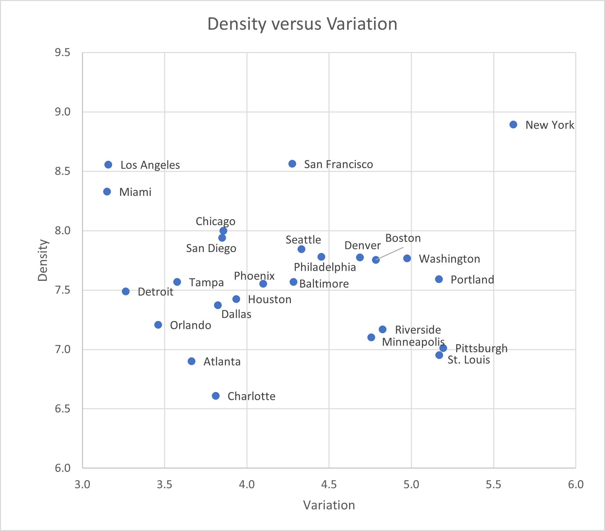
In the chart above, the vertical axis measures density on a logarithmic scale. New York is of course the top, with San Francisco, LA, and Miami next. The least-dense of the top 25 metros is Charlotte. No big surprises.
The horizontal axis measures variation as an expected ratio. That is, if you took two random Census Tracts from the New York metro area, you’d expect one of them to be 5.6 times as dense as the other. Los Angeles is at the opposite extreme: if you took two random LA-area tracts, chances are one would be just 3.2 times as dense as the other.
The only other big metro that’s similarly dense and uncentered is Miami; expanding to the top 50 metro areas, Las Vegas is the same.
At the opposite extreme are metros that peaked early, and thus have dense cores and real downtowns, but expanded less in the postwar era: St. Louis, Pittsburgh, and (among smaller metros) Richmond, Memphis, and Rochester.
This exercise could easily be improved on – metropolitan area boundaries are somewhat arbitrary, and there are specific dimensions of centeredness, like employment concentration, that can illuminate further.
Technical details: I used 2019q2 HUD Aggregated USPS Address Vacancy Data. “Density” here is the natural log of ((residential addresses + 5*business addresses + other addresses)/area). I excluded tracts in the bottom percentile nationwide. “Variation” is exp(std dev(tract density)).